
The Center is Not a Point
Thinking and talking about the center of a distribution is probably second nature to most people. We all know what and average is and it’s very likely we use it without thinking about it. However, as it usually happens with things that are second nature, we don’t often stop to think about what it actually means. Not knowing what it actually means can lead to misunderstandings and misinterpretations. In this post I want to dig a bit deeper into the concept of the center of a distribution and the different ways to think about it.
The center of a distribution
Life is random. Or at least it seems that way when we lack the information to properly explain and model it. That means that most of the things we measure are not deterministic, but rather stochastic. They are random numbers that follow a certain distribution or rule that governs how they behave. The classic example is the height of people. People come in all shapes and sizes, but they follow a certain distribution. This distribution is what tells us that it’s very unlikely that we find a 4 meter tall person and it’s very unlikely that we can find a 0.5 meter tall person. There seems to be a natural tendency for the height of people even though we know that there are people that are taller and shorter. We can clearly visualize this tendency by plotting the distribution of heights of people. All we would need to do is collect a large dataset of heights and then plot a histogram.
For example, you might collect a table that looks like this:
| height |
|---|
| 1.75 |
| 1.80 |
| 1.85 |
| 1.90 |
| 1.95 |
| 2.00 |
Then you can plot a histogram of the heights:
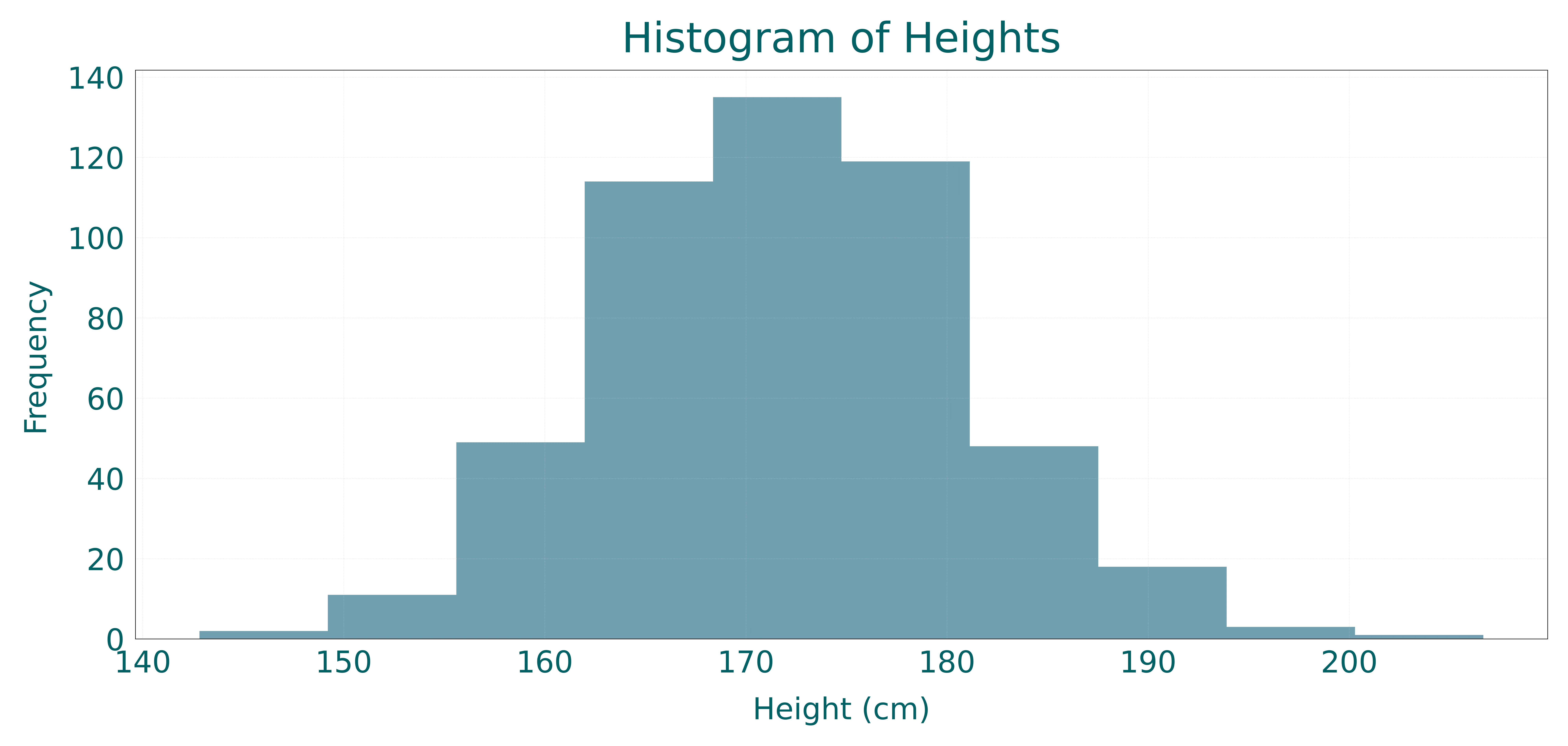
This histogram shows us the distribution of heights of people. We can see that most people are around 1.70 meters tall and there are a few people that are taller and a few people that are shorter.
Now, what happens when we want to summarize this distribution? In life, we often want a single number that helps us understand and describe the distributions we see around us. This process is so engrained in us that at this point you are probably already thinking about calculating the average height of the people. However, the average is not the only way to summarize a distribution. There are many other ways to summarize a distribution, each one has its own advantages and disadvantages. The most common one is to try to describe the center. The center of a distribution is a measure of the central tendency of the distribution, it is a single value that represents the most likely or most common value.
Let’s take a closer look at some of the most common ways to describe the center of a distribution.
The mean or average
The mean or average is the most common way to describe the center of a distribution. It is calculated by summing all the values in the distribution and dividing by the number of values.
Where is the value of the -th observation and is the number of observations. Let’s see what that looks like in our height distribution.
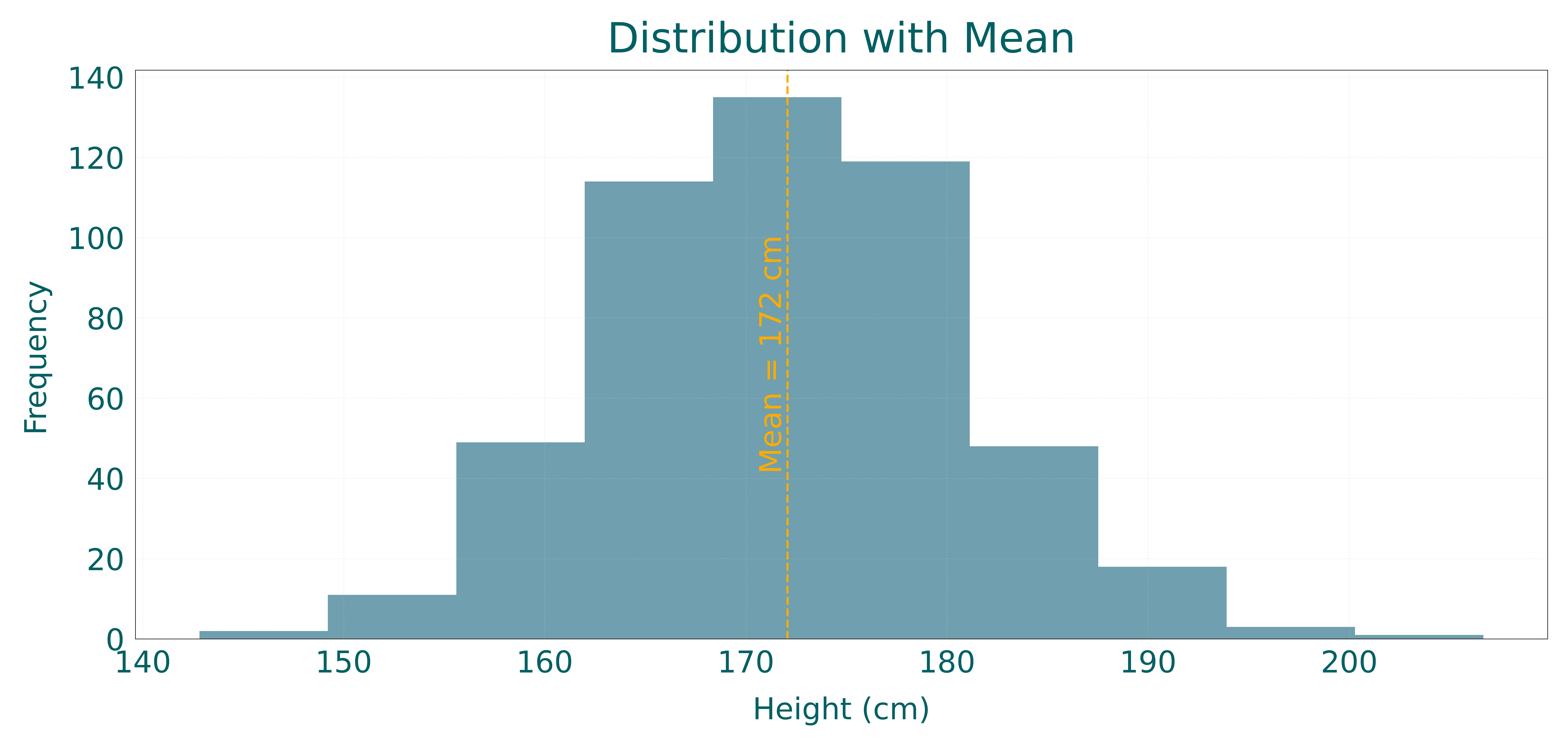
As you can see the mean describes really well the location of the center of the distribution. It give you a pretty good idea of what is a likely value to observe. However, it’s not as simple as it seems. The mean is very sensitive to outliers. Outliers are values that are very different from the rest of the values in the distribution. They are often caused by errors in the data collection process or by extreme values that are not representative of the population. If you add a few outliers to the distribution, the mean will be pulled towards the outliers. This is why the mean is not always the best way to describe the center of a distribution.
Think about the following example. The distribution of heights we were seeing before was for a single city. Due to genetics, people from different cities might have different heights. Let’s expand our dataset to include heights from multiple cities.
| city | height |
|---|---|
| Ithaca | 1.75 |
| Troy | 1.80 |
| Sparta | 1.85 |
| Athens | 1.90 |
| Ithaca | 1.95 |
| Sparta | 2.00 |
Let’s take a look at the different distributions for each city.
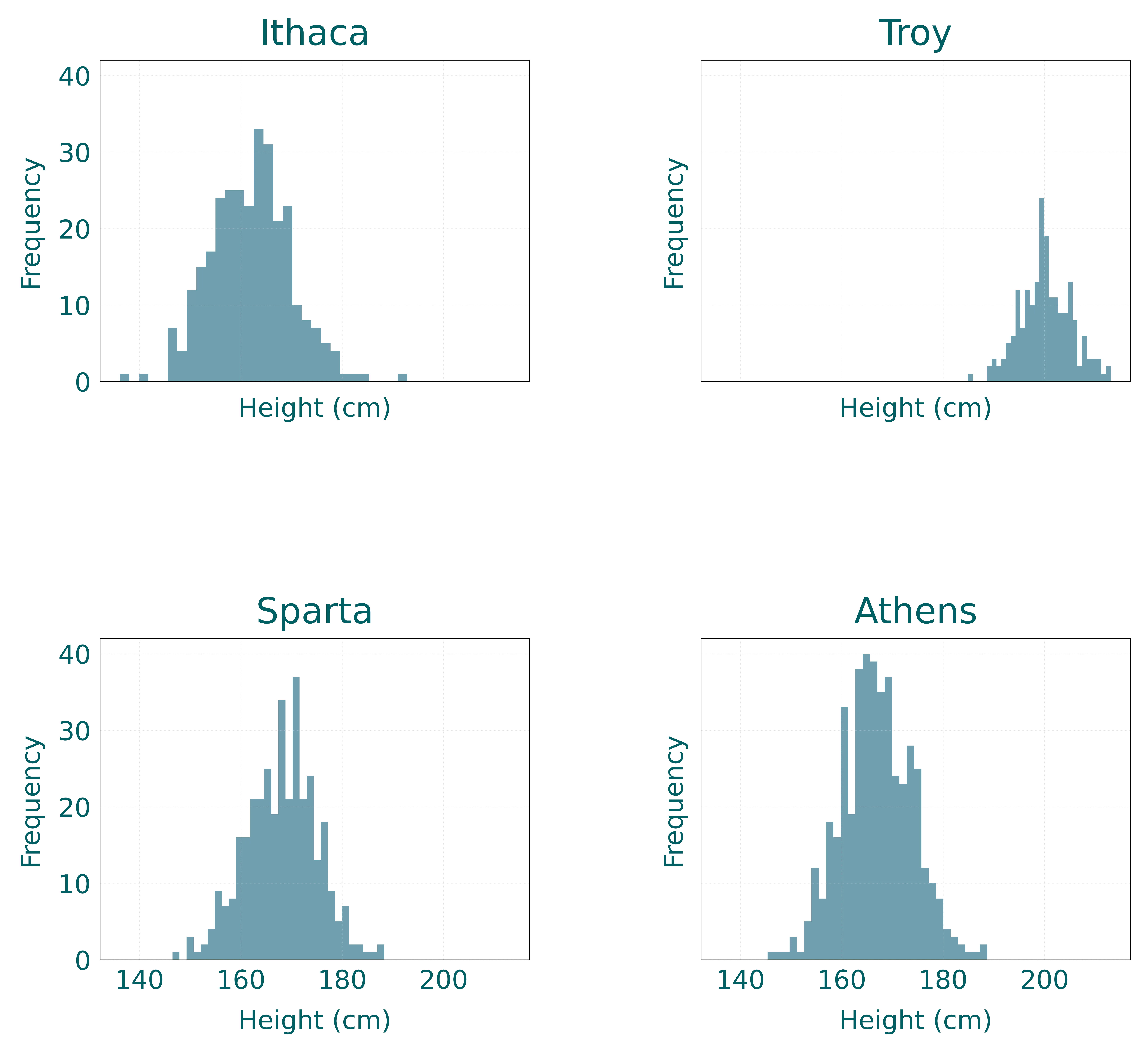
We can add the individual means for each city to the distribution.

Great, we can see that the mean for each city is different and it’s a decent approximation of the center of the distribution for each city. However, what happens if we don’t split the dataset by city and we just calculate the mean of all the heights?
Let’s look at the combined distribution.

Does that look like the center of the distribution? Probably not. In fact, something we can do is calculate what percentage of the sample is below and above the mean.
Where is the indicator function that is 1 if and 0 otherwise.
In python we can do something like this:
percentage_below_mean = np.mean(df["height"] < df["height"].mean())
percentage_above_mean = np.mean(df["height"] > df["height"].mean())
This will give us the percentage of the sample that is below and above the mean.
Let’s plot the distribution with the percentage below and above the mean.
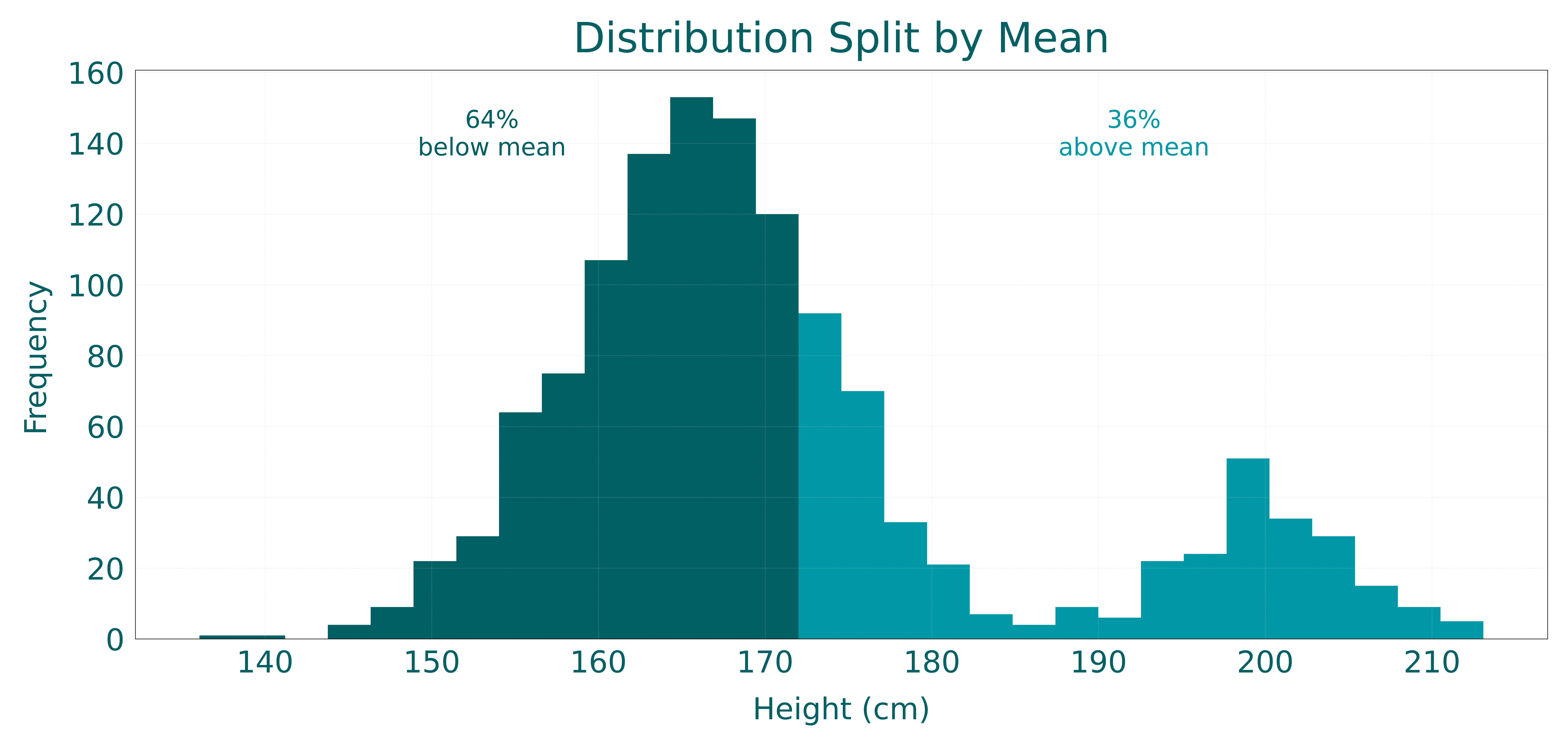
We can see that most of the sample is below the mean and very few are above the mean. This is because the mean is very sensitive to outliers. It gets pulled towards the outliers and distorts the true center of the distribution.
The median
The median is defined as the middle value of the distribution. It is calculated by sorting the values in the distribution and then finding the middle one. By definition, this makes the median the value that is greater than 50% of the values in the distribution and less than 50% of the values in the distribution.
Where is the middle value of the distribution and is the number of observations.
Let’s see what that looks like in our height distributions.
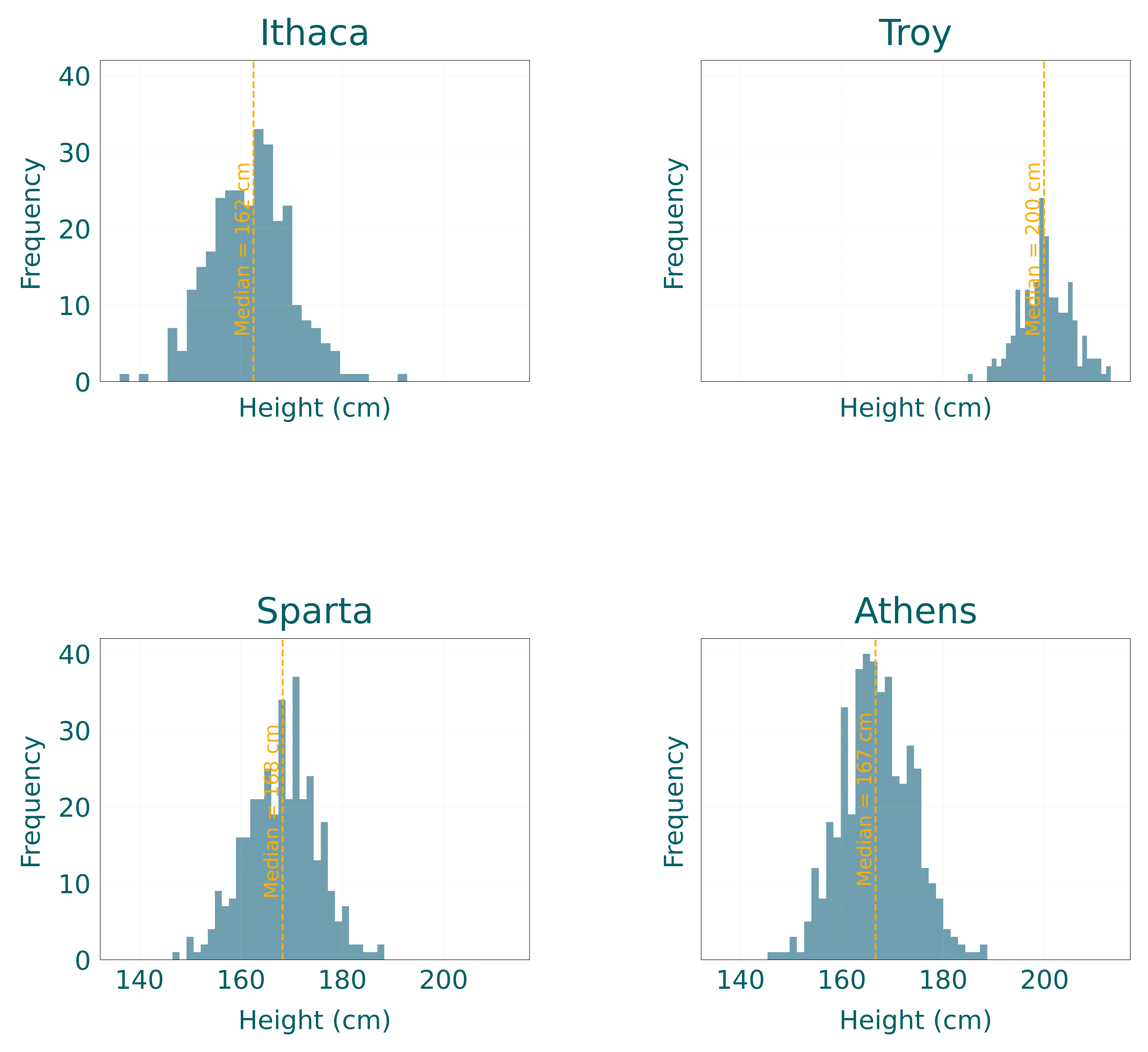
Similar to the mean, the median is a good approximation of the center of the distribution. In fact, the values for the mean and median are exactly the same for each city. What happens when we combine all the cities together? Let’s look at the combined distribution.
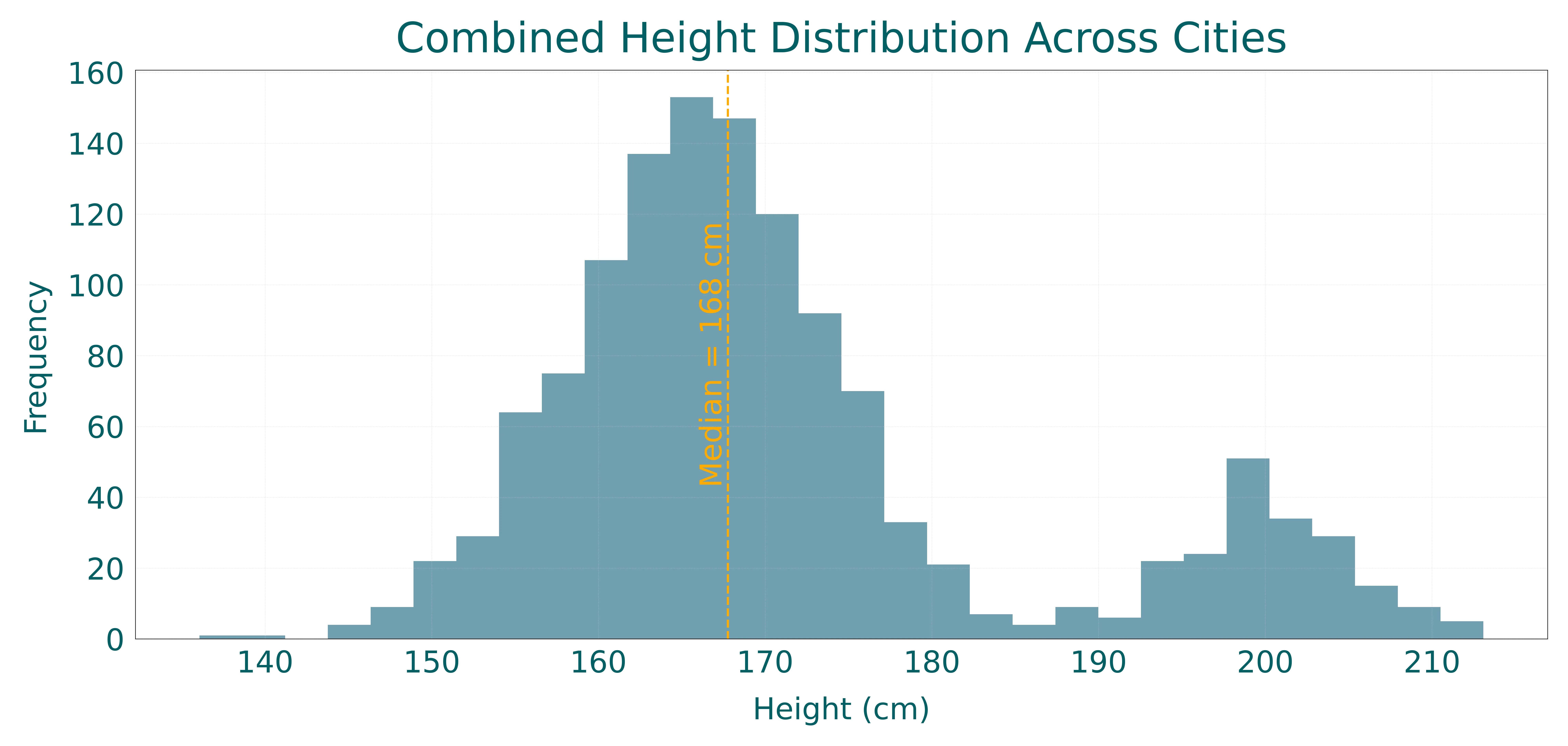
We can see that now the mean and the median are different. This is because the median is not as sensitive to outliers as the mean and it’s a more robust measure of the center of the distribution. By definition, the median sits in the middle of the distribution and we should have 50% of the sample below and 50% of the sample above it. We can see that by plotting the percentage below and above the median.
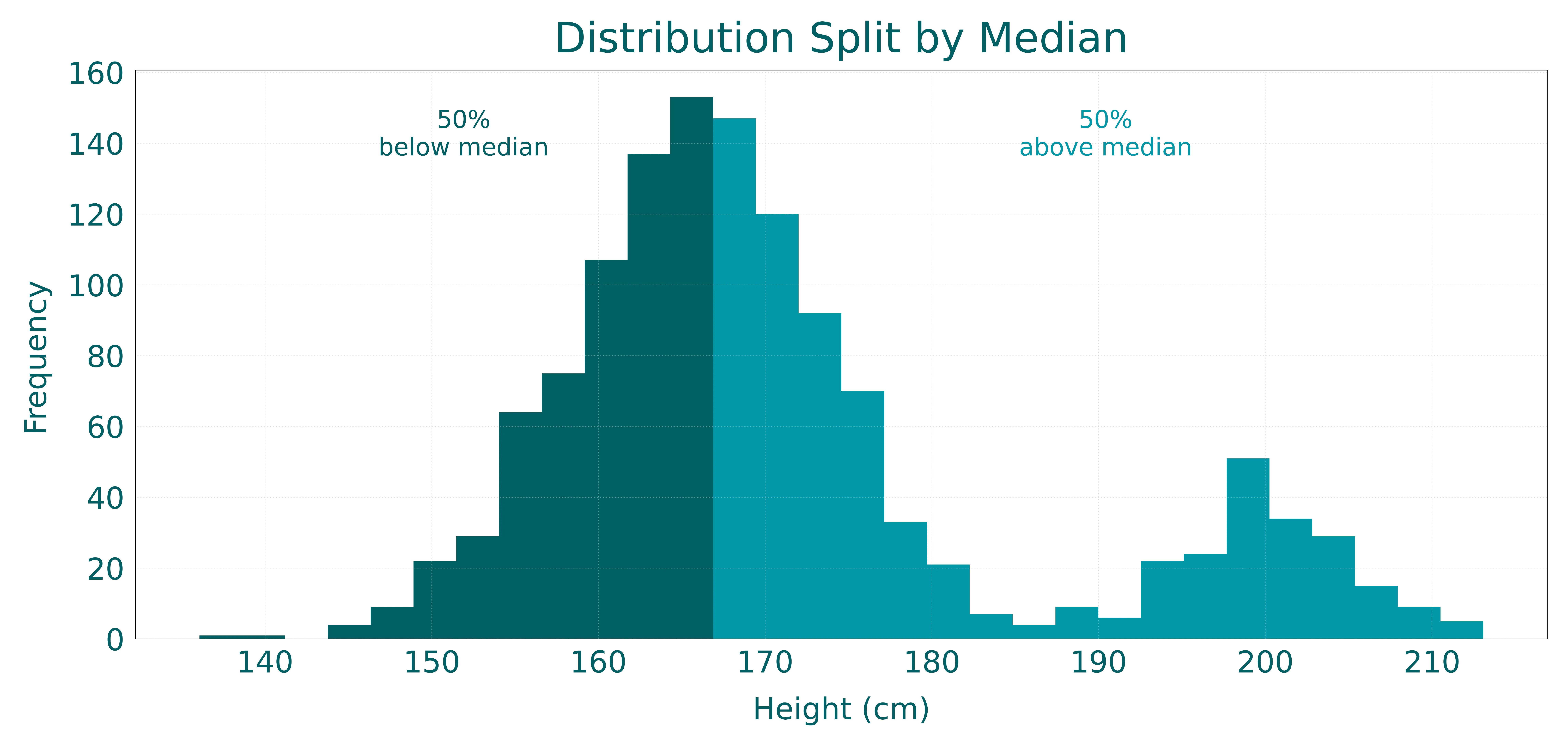
Unsurprisingly, we can see the 50% split that we expected.
At this point you might be thinking that the median is the best way to describe the center of a distribution. However, there are still some issues with the median. One of the most relevant ones is that the median lacks decomposability compared to the mean. This means that the mean can be calculated from subset metrics without needing to use the raw data. This is not true for the median since it needs to order the data to find the middle value.
Let’s take a look at an example. Let’s say you have the mean height for each city together with the sample size and you want to calculate the mean height for all the cities combined. You can do this by simply multiplying the mean height by the sample size and then dividing by the total sample size.
| city | mean height | sample size |
|---|---|---|
| Ithaca | 1.62 | 300 |
| Troy | 2.00 | 200 |
| Sparta | 1.68 | 350 |
| Athens | 1.67 | 450 |
Then the mean for all cities combined is:
The fact that the mean is decomposable while the median is not has practical consequences for how these statistics can be used in real data processing. Because the mean can be combined exactly from partial aggregates, it scales smoothly across distributed systems, allows efficient streaming updates, and supports better privacy by using only summary values. In contrast, the median’s non-decomposability makes it more computationally demanding: systems must retain additional information about the full distributions or rely on approximation methods, increasing storage, communication, and processing costs. This difference means that, in large-scale applications, the mean is often far easier and cheaper to compute reliably than the median.
Issues with point estimates
As we have seen, point estimates can be extremely useful for summarizing a distribution, giving us a single value that describes the underlying distribution. However, they are not without their issues. At this point you should’ve noticed that there are always trade-offs and there’s not a perfect metric.
Regardless of the metric we use, the fundamental problem with point estimates is that we are compressing an entire distribution into a single number. Think about all the information we are throwing away. When we say “the average height is 1.71 meters” we are losing information about:
- How spread out the heights are
- Whether the distribution is symmetric or skewed
- How confident we are in that estimate
- Whether there are multiple modes or peaks
- The presence of outliers or extreme values
This compression is sometimes necessary, after all, it’s much easier to communicate “the average height is 1.71 meters” than to share an entire dataset or distribution. But we need to be aware of what we are losing.
The uncertainty we ignore
If there’s anything I want you to take out of this post is this: every point estimate is uncertain. When we calculate a mean or median from a sample, we’re not actually measuring the true population parameter, we’re estimating it from limited data. If you collected a different sample of heights, you’d get a slightly different mean. This is where the Bayesian perspective becomes incredibly valuable.
From a Bayesian viewpoint, we shouldn’t think of the mean as a single fixed number. Instead, we should think of it as a distribution itself, a distribution of plausible values for the true population mean, given the data we have observed. In other words, instead of saying “the mean is 1.71 meters,” we should be saying something like “the mean is probably around 1.71 meters, but it could reasonably be anywhere from 1.68 to 1.72 meters.” This uncertainty is captured in what statisticians call the posterior distribution, the distribution of possible parameter values after seeing the data. Traditional point estimates like the mean or median are just single points from this distribution (often the mode or the median of the posterior), but the full distribution tells us so much more about what we actually know.
Working with distributions
So what’s the alternative? Ideally, we should get more comfortable working directly with distributions rather than always collapsing them down to single numbers. Modern computing power makes this increasingly feasible. Instead of reporting just a mean or median, we can:
- Show visualizations of the full distribution (as we’ve done throughout this post)
- Report uncertainty intervals (e.g. “the mean is 1.71 meters with a 95% credible interval of [1.68, 1.72]”)
- Use Monte Carlo simulation to propagate uncertainty through calculations
- Keep track of entire distributions in our analyses and only summarize at the end when absolutely necessary
Even if you can’t always work with full distributions in your daily work, simply being aware that there’s an entire distribution hiding behind every point estimate changes how you think about data. It makes you more skeptical of overly precise conclusions. It makes you ask questions like “how much data was this based on?” and “what’s the uncertainty around this number?” It makes you realize that a mean of 1.71 meters based on 10 samples is very different from a mean of 1.71 meters based on 10,000 samples, even though the point estimates are identical.
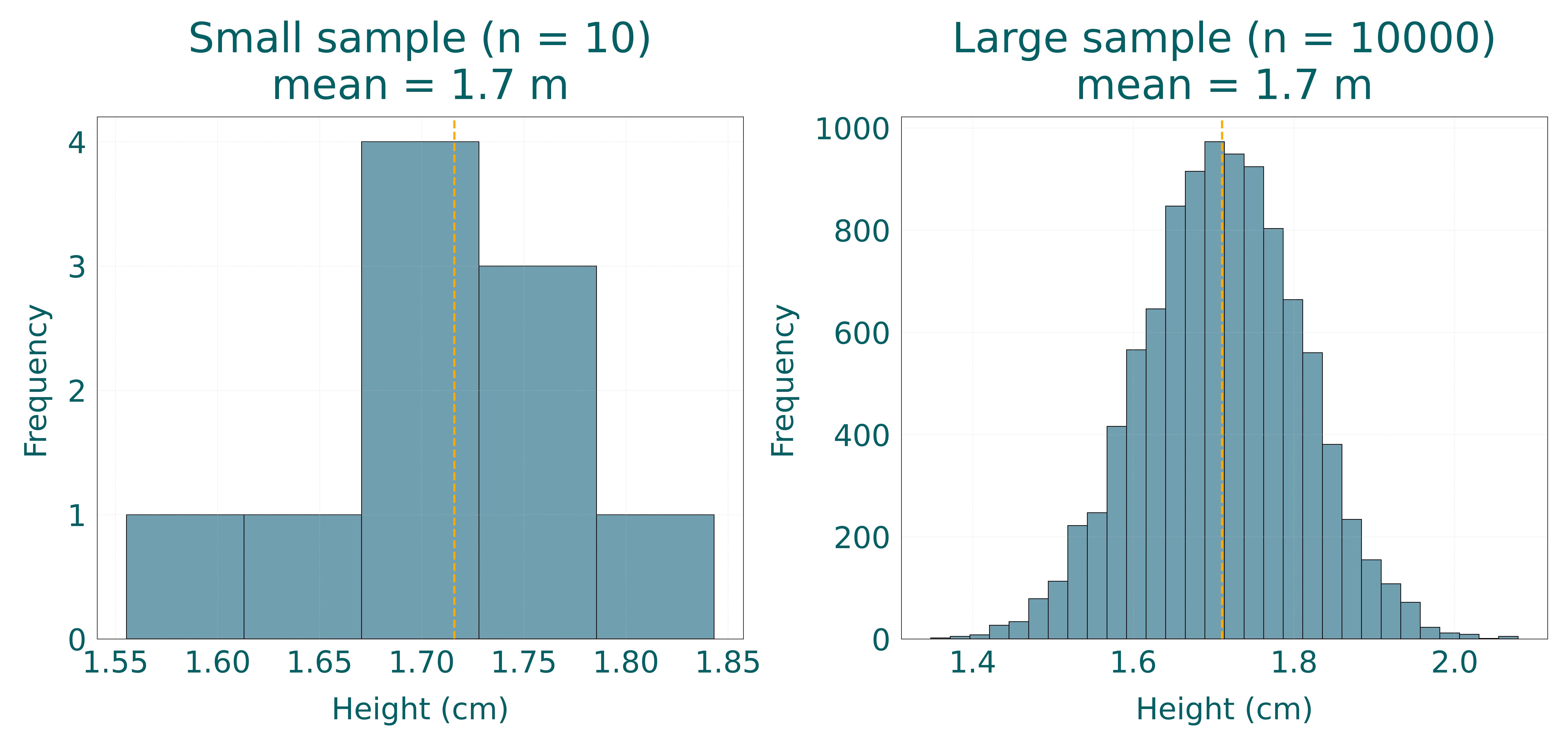
The next time someone gives you a single number to summarize a complex phenomenon, take a moment to imagine the full distribution behind it. What shape might it have? How much uncertainty is hiding in that single number? What information have we lost by reducing it to a point? These questions will make you a more thoughtful consumer and producer of statistics.
Censoring
The last thing I want to touch on is the concept of censoring. To me censoring is one of those things that once you understand it, you can’t unsee it. Censoring is a concept that is used in statistics to describe the situation where we have data that is not complete. Let’s change our example a bit for this one. Imagine you want to analyze how long deals take to close once they enter your pipeline. You have a dataset of deals that have been created in the last year and you want to know how long they take to close. Your dataset might look like this:
| deal id | created at | closed at | stage | diff_days |
|---|---|---|---|---|
| 1 | 2023-11-01 | 2023-12-05 | Won | 34 |
| 2 | 2023-11-02 | 2023-12-06 | Won | 34 |
| 3 | 2023-11-03 | In Progress | ||
| 4 | 2023-11-04 | 2023-12-08 | Won | 34 |
| 5 | 2023-11-05 | 2023-12-09 | Won | 34 |
| 6 | 2023-11-06 | In Progress | ||
| 7 | 2023-11-07 | 2023-12-10 | Won | 33 |
| 8 | 2023-11-08 | 2023-12-11 | Won | 33 |
| 9 | 2023-11-09 | In Progress | ||
| 10 | 2023-11-10 | In Progress | ||
| 11 | 2023-11-11 | In Progress | ||
| 12 | 2023-11-12 | In Progress | ||
| 13 | 2023-11-13 | In Progress |
Now we can calculate the average time it takes to close a deal to get an idea of the center of the distribution.
Oh wait, a new deal just closed while we were calculating things, let’s update the dataset.
| deal id | created at | closed at | stage | diff_days |
|---|---|---|---|---|
| 1 | 2023-11-01 | 2023-12-05 | Won | 34 |
| 2 | 2023-11-02 | 2023-12-06 | Won | 34 |
| 3 | 2023-11-03 | In Progress | ||
| 4 | 2023-11-04 | 2023-12-08 | Won | 34 |
| 5 | 2023-11-05 | 2023-12-09 | Won | 34 |
| 6 | 2023-11-06 | In Progress | ||
| 7 | 2023-11-07 | 2023-12-10 | Won | 33 |
| 8 | 2023-11-08 | 2023-12-11 | Won | 33 |
| 9 | 2023-11-09 | In Progress | ||
| 10 | 2023-11-10 | In Progress | ||
| 11 | 2023-11-11 | In Progress | ||
| 12 | 2023-11-12 | 2024-02-04 | Won | 84 |
| 13 | 2023-11-13 | In Progress |
We will need to recalculate the mean.
Wait a minute. The mean went from 34 days to 41 days just because a single deal closed. That’s a massive jump! And we still have 6 deals that are in progress. What happens when those close? Will the mean jump again? The answer is yes, and this is the core problem with censoring.
Censoring occurs when we have incomplete information about the outcome we’re trying to measure. In this example, we have deals that haven’t closed yet (they’re still “in progress”), so we don’t know their final closing time. The tempting thing to do is to simply exclude these incomplete observations and calculate our statistics based only on the deals that have closed. But this approach has a critical flaw: it systematically biases our estimates downward. Think about it. By only including deals that have already closed, we’re excluding all the deals that take longer to close. The deals still in progress might close tomorrow, or they might take another 3 months. We simply don’t know. But by excluding them, we’re essentially assuming they don’t exist, which means our estimate of the “average time to close” is only reflecting the faster deals. This is called right censoring because we don’t observe the right side (the end) of these events.
This is not a trivial problem. In fact, it’s everywhere once you start looking for it:
- Customer churn analysis: see Bayesian Approach to Understanding Churn
- Medical studies: When studying survival times for patients, some patients will still be alive at the end of the study (censored), making it tricky to estimate average survival time.
- Time to conversion: When analyzing how long it takes for leads to convert, the leads that haven’t converted yet are censored.
- Product failures: When studying how long products last before breaking, products still in use are censored observations.
The naive approach of calculating means or medians only from completed observations gives you biased estimates that are systematically too low. And the degree of bias depends on how much censoring you have. If most of your deals are still in progress, your estimate will be very biased. If only a few are in progress, the bias might be smaller, but it’s still there.
So what do we do? The proper way to handle censored data is through survival analysis, a branch of statistics specifically designed for this type of data. Techniques like Kaplan-Meier estimation and Cox proportional hazards models can provide unbiased estimates even in the presence of censoring. These methods don’t just throw away the censored observations. Instead, they use the partial information we have about them (we know they lasted at least until now) to improve our estimates.
But the key point here is that we need to be aware of what our data is actually telling us. When you calculate an “average time to close” by just taking the mean of closed deals, you’re not measuring what you think you’re measuring. You’re measuring “the average time to close for deals that have closed by now,” which is a very different thing from “the average time it takes for a deal to close.”
Next time you’re analyzing any kind of time-to-event data, ask yourself if you have censored observations. Think if you are systematically excluding certain outcomes by only looking at completed events. If the answer is yes, then your point estimates are hiding even more information than usual, and you need to think carefully about whether your analysis is actually answering the question you care about.